
Data
Presenting and analyzing results involves collecting, organizing, and analyzing data to assess
whether the hypothesis has been supported or falsified. In this section, data can be summarized
and presented in table, graphs, or figures. The purpose is to show the data in such a way that
the readers can interpret it for themselves. When completing a chart or data table for the
results section, use clear and concise descriptions instead of sentences that will make a chart
cluttered and difficult to read. The wording should be specific, for example, “no change” would
be better than “nothing.”
Reminder: Only include information that was observed or
calculated for the experiment. Comments or interpretations of the data/results should be
reserved for the analysis/discussion section.
Numerical data obtained from a procedure usually is presented as a table. Label all tables and provide a descriptive title. The first table is Table 1, the second table is Table 2, etc. The title should include all the information necessary to illustrate the experiment.

For all calculations, work must be shown with the appropriate units and significant figures. Include the formula and then insert the data.
Total Magnification of a Lens = (Magnification of the Oculars) x (Magnification of the Objective
Lens)
Total Magnification of the 40x Lens = (10X) x (40X)
Total Magnification of the 40x Lens = 400X
Diameter(high power) = Diameter(scanning) x [(Magnification(scanning) / Magnification(high
power)]
Diameter(high power) = [4.5 mm] x [(40X) / (400X)]
Diameter(high power) = [4.5
mm] x [0.1]
Diameter(high power) = 0.45 mm
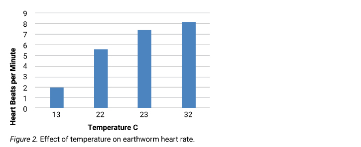
When graphs are necessary to express data, it is strongly recommended to make graphs in Excel. Label all pictures and graphs as figures Graphs and figures must be labeled with a descriptive title. The experimental design should be obvious when looking at a graph. The title should include both variables, their relationship, and the element or organism being tested. The first graph is Figure 1, the second graph is Figure 2, etc. Label the axes on a graph, being sure to include units of measurement. The independent variable is on the X-axis. The dependent variable (the one being measured) is on the Y-axis.

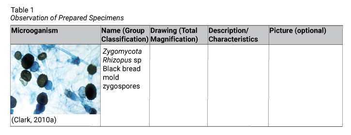
For an observational lab, a table may be arranged as shown below:
